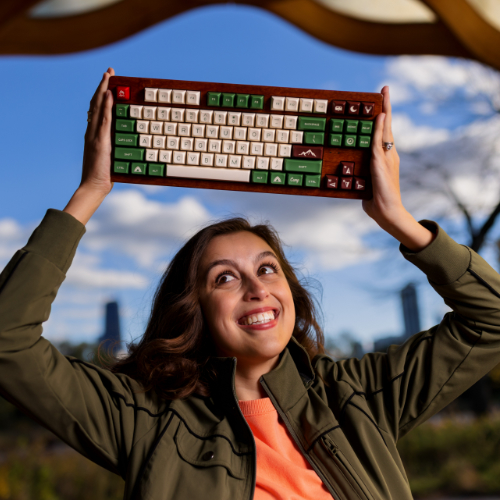
Shipping todometer, version 3!
If you haven’t seen it yet, one of my open source projects that I’ve been “maintaining” for a while is called todometer. It’s a glorified to-do app with a progress bar, in a desktop app. It’s built with Electron and React, and I first shipped it in early 2017!
todometer has served me well over the years, and so that’s why I put “maintaining” in quotes in that intro there. I admit I don’t often update it, because it does exactly what I want it to do: you check off a task, it fills a progress bar with green. You pause a task for later, and it fills the progress bar with yellow. At midnight, the bar resets, the paused tasks are unpaused, and the completed tasks are deleted.
At it’s core… the app probably looks exactly like it did 3, 5, and 9 years ago. BUT I made a bunch of changes that folks have been asking for for several years, and I openly admit now that the users were right, and this latest version is so much better.
Dependency updates
So firstly, dependency updates. The final bundle size is a bit smaller, at less than 100MB on Windows and 118MB on Mac. Electron and React are a bit heavy, but with every new update, they do get smaller! I’ve considered switching to Tauri at some point, but… honestly the Electron ecosystem keeps me here. It’s really good.
I also recently talked about how I moved all styling to native CSS, thanks to the latest web technologies allowing me to do so, and was able to update how notifications worked under the hood with the help of some good ol’ AI tools.
Getting everything modernized was important for literally every other feature to happen. The last release of this app was in 2020, and though I had done some minor changes here and there since then, this was the first time I put some real effort into it.
Editing to-dos and rearranging them
Being able to edit and organize tasks has been the #1 feature request of the entire app since it came out. I admit I dragged my feet on this one, mainly because:
- I never really edited any tasks, and if I did I would just delete it and recreate it
- I didn’t know what I wanted the editing feature to look like
- State management across buckets for dragging and dropping sounded like a slog
For #1… I had to get over myself. Took some time. People were right.
For #2, that took some design ideation. I mocked up so many ideas on paper and just on CodePen for ideas on what I could do to make editing look smooth. I didn’t like the idea of adding more icons to the screen (which is what some other pull requests did in earlier versions of the app, when folks lovingly tried to contribute during my feet-dragging era), and I didn’t want to rely on just a color change to show that something was being edited. Eventually, I was pretty happy with the result:
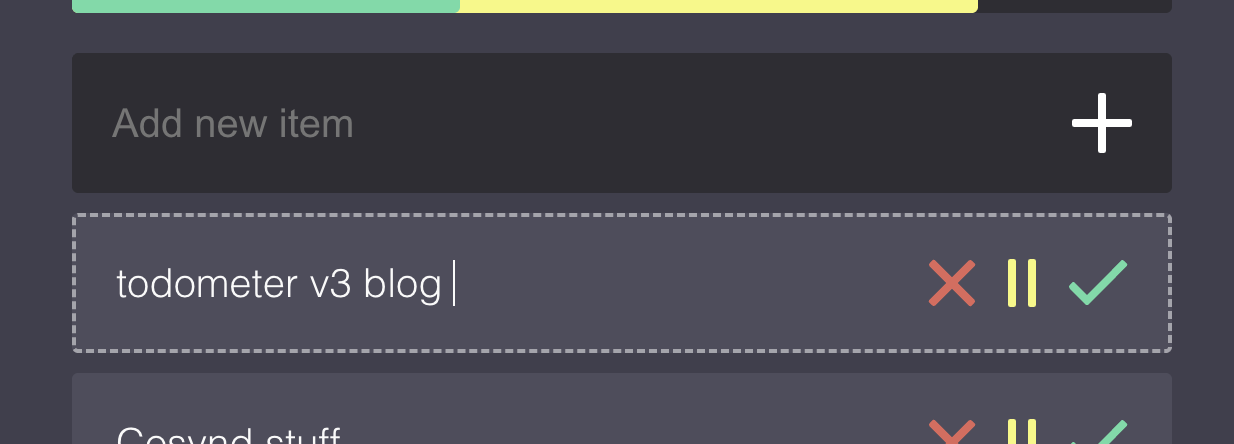
You can click the actual task words to go into editing mode (or navigate to a task via keyboard), edit, and then hit enter or click away to make the edits work. It feels clean, and I am really glad I did it like this!
Now, for dragging and dropping… ugh that was a lot. I did probably too much research on which libraries I wanted to use for it (I ultimately used dnd kit), and spent an absurd amount of time on the timing of the animations for opening different collapsed categories, and how items would look moving across categories. Luckily I was able to reduce some of the state management slog that I expected with some handy dandy AI tooling (shoutout GitHub Copilot), and here’s what it looks like now!
Look and feel updates
Okay if you saw the diff of the icon updates to this app you would probably laugh at me because they’re SO minor, BUT I’ve been wanting to round the corners of all the icons for a while, and finally got off my butt and did it. That’s right: all of the icons in the whole app are lovingly hand-crafted SVGs. I regret that decision. But here we are.
I ended up changing the logo of the app, too! I rounded the corners, and made the checkmark have a bit of yellow in it, to match the progress bar in the app itself. Feels more unique than just the green checkmark, and now the the actual icons across platforms have better sizing in general.
Outside of images, again, most of the app looks exactly the same, but now there’s a menu button at the bottom of the app where the “reset progress” button used to be. What could that be?
(it’s a settings menu)
The settings menu and its implications
The new settings menu pulls things out from the native Electron menu (which I want to tweak more, but felt scope-creep-y), and has a few specific configurations that pull in some larger feature changes.
Notifications
These are the same as before, but now moved into this menu. Users can toggle on/off reminder notifications of tasks, their timing, and see an example notification.
Data vault
This might be one of the largest changes of the entire app: your data is now in an SQLite database, rather than using local storage! This is something I’ve wanted to do for years but truly just hadn’t put in the effort, because it would touch several more delicate parts of the app.
For implementing this, I admit because I was intimidated by all that I knew I had to write, I made a particularly detailed spec document and handed it off to GitHub Copilot + Claude Opus 4.6 to build most of the foundations. In retrospect… that doc probably took as much time as it would take to just write the code myself, but c’est la vie.
Now that it’s done, in this menu, users can put their “data vault” file anywhere on their computer, which means they can put it in a cloud folder (like Dropbox or something) and sync tasks across devices!
Later, I do think I want to set up some kind of syncing service so that folks don’t have to think about where their vault lives. I tried to set things up in a way to make room for that, we’ll see how that shakes out in time.
Local API + MCP server + todometer:// protocol
Because Electron runs Node, a thing I’ve always thought would be neat is to have the ability to spawn some kind of local API with the app for other local apps to use, and some kind of local protocol. And, now that AI tools are more of a thing, I thought I could expand that to an MCP server as well!
Documentation for these features is here.
Turns out that part wasn’t too bad to implement (again with some handy dandy AI tools), and I already was able to use the MCP server in a VS Code chat window, which was pretty cool to see. I might make a browser extension as well to help enhance the app experience.
This should also hopefully make a little app ecosystem work well with todometer, which is something I’ve always wanted to figure out, and now I’m excited that it’s a real possibility now!
Menu button configuration
In addition to the menu button that opens up all of these things, you can now also enable or disable the “reset progress” button (which treats the app like a new day, where completed tasks are deleted and paused ones are moved up), and also toggle a “copy list” button that copies your tasks to your clipboard. That copy one is a button I’ve wanted to add for a while purely because I copy and paste my finished task list for standup at work pretty regularly, and this makes that process just a liiiiittle bit faster.
Build process, releases, and updates
And finally, the last thing that users don’t really “see” but it makes a difference, is the updates to the build process for the app.
Before, I literally just built all the versions of the app on my local machines, tested them locally, and then uploaded them to a tagged release. It was annoying and dumb. Now, that building process is done when a new tag is created via GitHub Actions, and creates a draft release! I also have proper code signing finished for Mac, and hopefully will have Windows done soon, too.
Alongside the build process being updated, I added in the ability to automatically check for the latest updates and builds from the app itself. That is a huge game-changer too, being able to just click a button and the app works.
Try it, use it, share it, star it, etc.
Allllll of this being said, todometer v3 is here and I’m really excited about it! If you want to look through it more:
Please make Issues if you run into problems, share it with your buddies, smash that star button, and thanks for reading this far!